

It’s pretty. It’s full of greens, oranges, and browns. Some people say it’s supposedly a color dupe for the Anastasia Beverly Hills Subculture palette. The big question: is it any good?
Disclaimer: I now have affiliate links. If you click on a link or ad and you buy something, I may get a small commission at no cost to you. Also, as always, this post is not sponsored.
I love a good, colorful eyeshadow palette!
You know how it is. You see a palette that catches your eye and you think, “Ooooooh… it’s so pretty! I could do all kinds of looks with this!” Then you get it home and find out that the color payoff isn’t as good as you want it to be, the shadows don’t blend well, or all the colors turn muddy on your eyelids halfway through the day.
Yep! Been there, done that. As a matter of fact, I’ve had exactly those experiences with other Makeup Revolution eyeshadow palettes.
Now, I have a confession to make. Makeup Revolution eyeshadow palettes are pretty hit or miss for me. I hated the first two Makeup Revolution eye palettes I bought. The first eye palette from Makeup Revolution I actually liked was the original New-trals vs. Neutrals palette. Finally, I found an eye palette that seemed to live up to the hype I had heard about Makeup Revolution.
I have since bought and given to friends other Makeup Revolution eye palettes that didn’t really have the color payoff and wear I was looking for. So, when the Makeup Revolution eye palettes work for me, they really work. When they don’t, they really don’t.
So, what about this Iconic Division palette?
I had been eyeing this Makeup Revolution Re-Loaded Iconic Division eyeshadow palette for a while before I decided to get it. I have several warm toned palettes in my collection already, but nothing with this many greens and oranges. Honestly, the greens and that mustard yellow shade are what drew me to this one. Also, with a price point of only $7.00 USD, how could I pass it up?
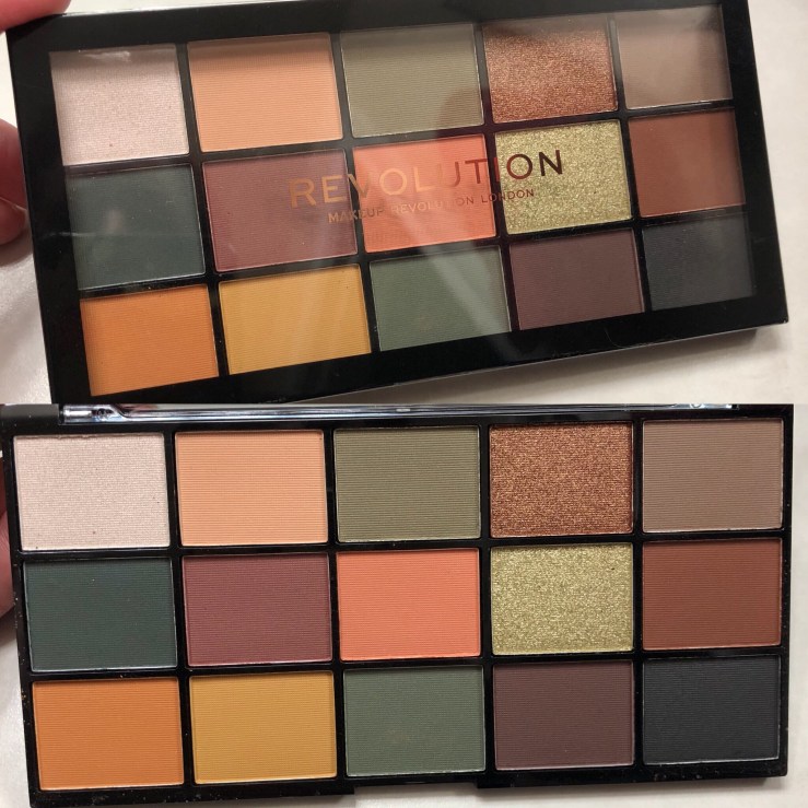
The packaging on this palette is black plastic with a clear lid so you can see the shadows inside. It doesn’t feel expensive, but it doesn’t feel super cheap, either. The palette name and ingredients are on the back. No shade names are included.
The eyeshadow pans are a good size. I feel like this palette would last quite a while, even with everyday use. It does not include any brushes or applicators. There’s really no wasted space in this palette.
What about the colors?
Despite having a bunch of greens, which usually tend to be cool, this palette actually trends warm. I don’t think I’ve been able to create a look with this palette that isn’t warm. That’s not to say that you couldn’t create a cool toned look with the Iconic Division palette, but it might be difficult without pulling in colors from other sources.
The other thing I find interesting about this palette is that most of the looks I’ve created with this palette tend to be dark. Even the simplest look turned out darker than I expected. Maybe if you have a deeper skin tone than mine, the looks may not turn out so dark. I’m a pale princess, so it’s not hard for eyeshadows to look dark on me.
How about the formula?
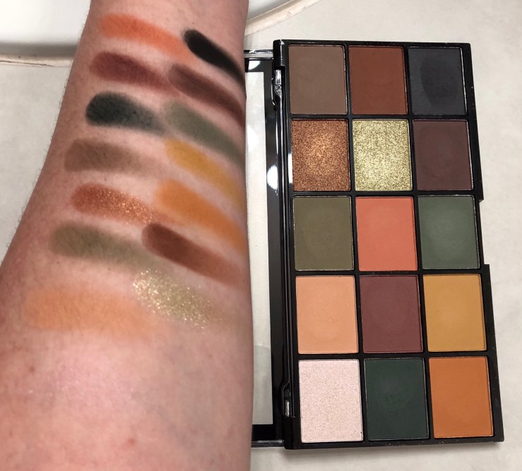
This palette has 3 shimmer and 12 matte shadows in it.
The mattes are nice.
The mattes are nicely pigmented and feel rather creamy when I swirl my finger on the surface. Most of the mattes finger swatch pretty well, even without primer.
When used on the eyes, the shadows go on pretty easily with a good color payoff, but will blend away if you’re not careful. The colors also get muddy if I try to blend too many shades over the same spot. On the upside, the mattes didn’t have much, if any, kick up when I dipped my brush into them. I also didn’t have any fallout under my eyes when I created looks with them.
The shimmers are another story…
The bronze shimmer shade is the most useable. It has the best color payoff and is the easiest to apply. It goes on pretty well with either a brush or a finger. Use a finger for more shimmer.
The bright citrine green shimmer is more sparkle than pigment, and is best used as a topper over another shade. Getting some of this shadow on your brush and spritzing it with a bit of setting spray does help with application.
The white shade with a pink shift is useless. I thought it would be a pretty sheer shimmery pink to layer over other things, but it really doesn’t do anything at all. I have tried to apply it with a brush, both dry and damp, and with my finger. I have tried scraping the top layer off to see if the powder underneath was better. It was no use. You can see in the swatch photo that I can’t get that color to show up at all.
Show us your eyeshadow looks!
Alright, here you go!
Look #1
This first look, I started by patting Milani’s eyeshadow primer on my lids. I created this look to match the brown and green outfit I was wearing that day. That’s usually where I get the inspiration for my eyeshadow looks each day. I used the lighter khaki green as the base color of the look and uses the browns and burgundy in the cease and outer V. For the sparkle, I used the citrine green as a topper and added a dab of Colourpop’s Super Shock Shadow in the shade Fringe on the inner corner.

Look #2
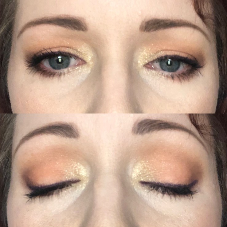
For this look, I started by patting bh cosmetics’ waterproof eye primer on my lids. I wanted to use the peachy shade from the palette at a base color. I used the citrine green to brighten the inner corner of the eye, and the deep warm brown shade to add depth at the outer corners.
Look #3
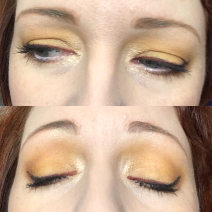
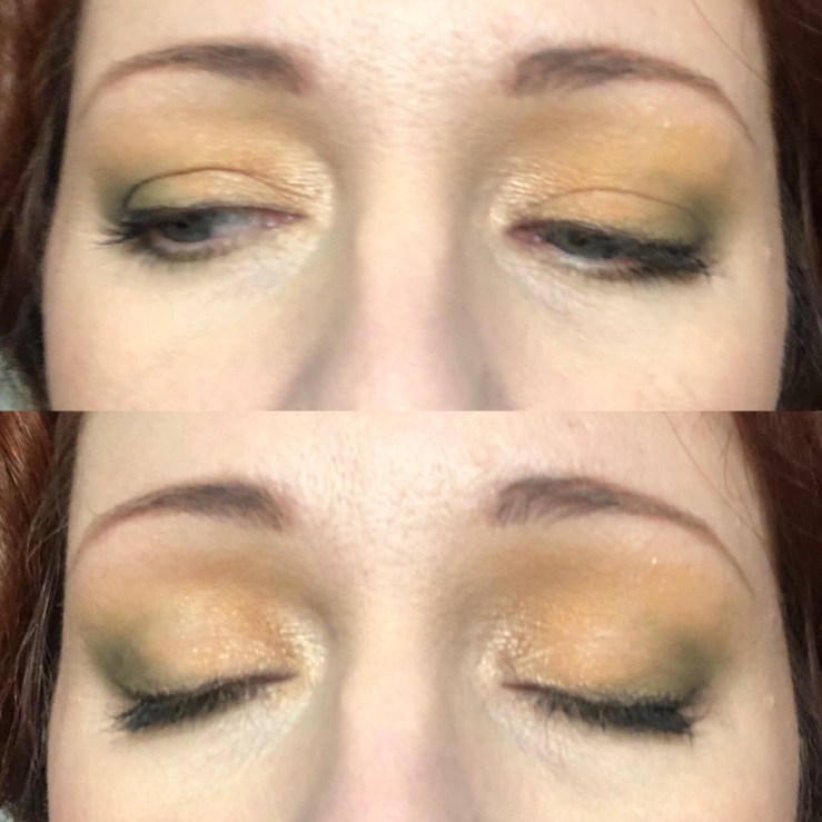
For look #3, I again started by patting bh cosmetics’ eye primer on my lids. I really wanted to use the mustard yellow color for a single shadow look. It’s pretty, but I felt it needed a bit of help from the bronze shimmer shade to look finished. I also had to bring in a bit of Mary-Lou Manizer from The Balm’s The Manizer Sisters palette to brighten the inner corner and add a subtle shimmer to the brow bone. I used two different eyeliners for a two-toned look. I was hoping this look would be a bit brighter, but that is not what the mustard yellow was going me. Oh, well.
And finally, Look #4
For look #4, I used Nyx’s HD eye primer as a base. I started off using the light flesh shade as a transition at and just above the crease, and the orange cream shade as my base color on the lid. I definitely wanted to have green in this look, so I used the light and dark khaki greens in the crease, outer V, and the outer third of the eye lid. I then used a little highlighter from the Makeup Revolution Ultra Contour Kit in Fair to the brow bone and inner corner to finish.
So, would you recommend the Makeup Revolution Re-Loaded Iconic Division eyeshadow palette?
Yes… and no.
If you are wanting to make complete looks, without having to bring in other shadows from other sources, this is not the palette for you. It has no highlight shade. It has a couple of shadows that could be used as transition shades at most. Also, most of the colors have the same saturation. It’s pretty easy for eye looks to go muddy with this palette, and some of the darker shade seem to blend away quite easily.
Now, if you are drawn to greens and oranges and think these shades would be good to use in addition to other shadows you have, then yes, I would recommend it.
I do like the formula of the matte shades in the Iconic Division, and will probably use them in conjunction with other shadows I have for some dramatic, green-based, fall looks. We’ll see if this palette ends up in my Give to Friends bag.
